Render Markdown in Nuxt 3 and Highlight Syntax with Nuxt MDC

components/mdc/, as of Nuxt MDC v0.13.0. The modules referenced in this source code of this guide have also been updated to their latest versions.Introduction
Markdown is a frequently used markup language to build the content of static blog websites. When working with Nuxt 3 you can utilize the official Nuxt Content module to build a blog from Markdown files. The module provides many features, including code highlighting and an enhanced Markdown syntax known as MDC (MarkDown Components) to integrate Vue components into Markdown seamlessly.
However, if you want to query Markdown content from a dedicated API or CMS, additional effort is required to render and highlight your content. One approach involves building a helper function with a transformer from the Nuxt Content module to parse Markdown strings. That way you can still use the MDC syntax but you are leaving most Nuxt Content functionality untapped. Alternatively, you can create a plugin leveraging the markdown-it parser within your Nuxt 3 application. The parser follows the CommonMarc Spec, provides supplementary features and supports syntax highlighting with highlight.js. Nevertheless, this method is cumbersome and using Vue components in the Markdown content is not possible.
Fortunately, the Nuxt module MDC allows you to parse and render Markdown queried from a dedicated API or CMS in an elegant manner. The module is utilized by Nuxt Content under the hood and therefore provides you with many useful features, such as using Vue components in Markdown, syntax highlighting and more. At the same time the module is lighter compared to the Nuxt Content module.
In This Guide
This guide provides a comprehensive walkthrough for integrating the Nuxt MDC module into a new Nuxt 3 application. It begins with an introduction to the module, followed by step-by-step instructions on installation and configuration to enable Markdown content rendering and syntax highlighting. A simple example illustrates the process of parsing and rendering Markdown using the module's <MDC> component. Furthermore, it showcases the enhancement of Prose components to integrate additional features into Markdown content, with an example extending the <ProsePre> component. At the end you will find a link to the source code, ready to serve as a foundation for your upcoming projects. Throughout this guide, the Composition API and <script setup> syntax are utilized.
Setup
- Nuxt 3.16.2
- Vue 3.5.13
- Nuxt MDC 0.16.1
- node 22.13.1
- npm 10.9.2
Prerequisite
Before proceeding with this guide, ensure you meet the following requirements:
- Basic understanding of how to work with Nuxt 3
- Basic understanding of the Markdown syntax, including inline code and code blocks
- node.js and npm are installed on your machine
What is Nuxt MDC?
Nuxt MDC is a module designed to parse and render Markdown within your Nuxt 3 application. It is used by Nuxt Content and offers a plethora of additional features. The most powerful feature is the ability to use Vue components in your Markdown content. This extended syntax not only supports Vue components but also regular HTML tags and so called Prose components, which are native to Nuxt MDC. These Prose components are rendered instead of regular HTML tags by default and can be further customized to add extra functionalities or entirely disabled if necessary. Another significant feature provided by Nuxt MDC is syntax highlighting for code blocks, powered by the Shiki Syntax highlighter (explore all Shiki features on GitHub).
Nuxt MDC exposes three components to parse and render Markdown: <MDC>, <MDCRenderer> and <MDCSlot>. The <MDC> component takes raw Markdown content written with MDC syntax, parses it with the parseMarkdown() helper function and renders it within your Vue component or page with the <MDCRenderer> component. Additionally, the <MDCSlot> component serves as a replacement for Vue's native <slot> component, effectively rendering slot content while removing any unwanted wrapper elements. Since the <MDCRenderer> and <MDCSlot> components and the parseMarkdown() function are not within the scope of this guide, please check Github for more details.
Create a New Nuxt 3 Project
To initiate a new Nuxt 3 project named nuxt3_mdc_starter, navigate to your desired working directory in the terminal and execute the following command, as outlined in the documentation:
npx nuxi@latest init nuxt3_mdc_starter
Once the project is initialized, navigate to the project root direcotry and start the development mode to verify successful installation:
cd nuxt3_mdc_starter
npm run dev
Visit http://localhost:3000 in your browser to ensure that the application is up and running correctly.
Installing and Configuring Nuxt MDC
Stop the development mode and install Nuxt MDC by executing the following command:
npm install @nuxtjs/mdc
Next, Nuxt MDC must be registered in the nuxt.config.ts configuration file:
export default defineNuxtConfig({
  modules: ['@nuxtjs/mdc']
})
Additional configurations can be provided to Nuxt MDC using the mdc property, but is not necessary to begin parsing and rendering Markdown (refer to GitHub for details).
Rendering Markdown
Next, let's modify the app.vue component to illustrate how to render Markdown using the <MDC> component. Since fetching Markdown from a CMS is beyond the scope of this guide, we'll render the following boilerplate Markdown snippet to app.vue instead, inspired by the playground source code:
<script setup>
const md = `
# Welcome to docs4.dev

Paragraphs can contain inline code \`const codeInline: string = 'highlighted code inline'\`{lang="ts"} with language prop.

Code block:
\`\`\` typescript [index.js] {1, 3 - 5} additional meta data
import {parseMarkdown} from '@nuxtjs/mdc/runtime'

async function main(mdc: string) {
  const ast = await parseMarkdown(mdc)

  return ast
}
\`\`\`
`
</script>
This Markdown snippet includes a headline, a paragraph with inline code, and a code block. You'll notice additional information behind the inline code {lang="ts"} (line 5) and in the first line of the code block ``` typescript [index.js] {1, 3 - 5} additional meta data (line 8). These are part of the MDC syntax, allowing you to add extra attributes to inline code and code blocks, which are then processed by MDC and its Prose components.
The {lang="ts"} attribute is a language indicator, informing MDC about the language of the inline code. This information can be utilized by the syntax highlighter to apply a language specific highlighting. The code block can take the following four attributes:
- language (
typescript) - filename enclosed in square brackets (
[index.js]) - list of lines to highlight, wrapped with curly braces (
{1, 3 - 5}indicates line one and three to five) - additional metadata
These attributes are passed as props to the Prose component <ProsePre> and can be used for extended functionality (more on that below). The order in which you provide these attributes can vary to some extend, but you must start with the language.
To render the Markdown in app.vue, we need to assign the content to the :value property of the <MDC> component:
<template>
  <div>
    <MDC :value="md" />
  </div>
</template>
If you browse http://localhost:3000 you will see the Markdown being rendered as valid HTML5.
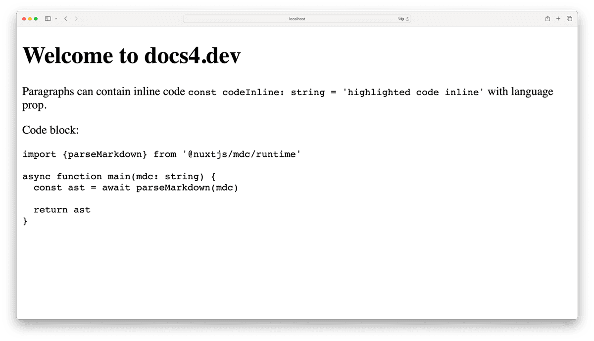
If you open your browser console and inspect the source code, you will observe that normal text is wrapped with <p> tags, inline code is wrapped with <code> tags and the code block is wrapped with <pre> tags. Additionally, you will also notice language-typescript appended as value to the class attribute of the <pre> tag (<pre class="language-typescript">…</pre>).
Prose Components
As previously mentioned, Nuxt MDC comes with more then 20 Prose components. These components are rendered instead of regular HTML tags. Alongside a template, they can contain styling and receive props, which can be used to add extra features to you Markdown content. For example, the <ProsePre> component, which is rendered instead of the <pre> tag, accepts the following properties: code, language, filename, highlights, meta, class (refer to the source code on GitHub). These properties can be used to display the filename the code belongs to, highlighting specific code lines or adding a copy button.
To use Prose components they must be enabled which is the case by default. To incorporate extra features, the corresponding Prose component must be extended. One simple method to achieve this is by creating a component with the same name and source code as the original Prose component inside the components/prose/ directory. Therefore, add ProsePre.global.vue under components/prose/ with the following code from the initial ProsePre component:
<template>
  <pre :class="$props.class"><slot /></pre>
</template>

<script setup lang="ts">
defineProps({
  code: {
    type: String,
    default: ''
  },
  language: {
    type: String,
    default: null
  },
  filename: {
    type: String,
    default: null
  },
  highlights: {
    type: Array as () => number[],
    default: () => []
  },
  meta: {
    type: String,
    default: null
  },
  class: {
    type: String,
    default: null
  }
})
</script>

<style>
pre code .line {
  display: block;
}
</style>
Note the .global suffix in the compont name. This is necessary for Nuxt MDC to resolve the custom Prose component. Alternatively you can register the enitire directory as global as described in the (documentation)https://github.com/nuxt-modules/mdc?tab=readme-ov-file#prose-components.
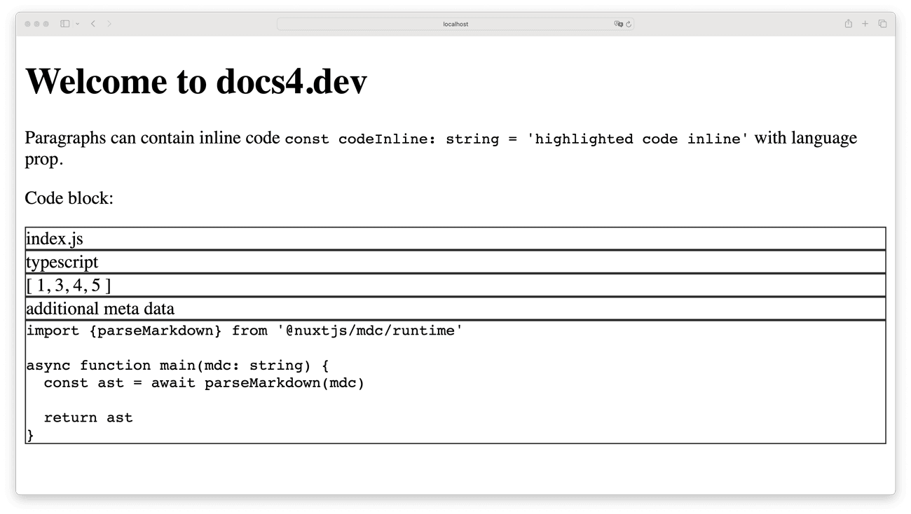
To demonstrate how to extend a Prose component, let's simply display the filename and other attributes added in the first line of the Markdown code block. All we need to do is reference the respective prop in the template if available. Therefore, change the <template> of ProsePre.vue as follows:
<template>
  <div class="pre-wrapper">
    <div v-if="filename">
      {{ filename }}
    </div>
    <div v-if="language">
      {{ language }}
    </div>
    <div v-if="highlights">
      {{ highlights }}
    </div>
    <div v-if="meta">
      {{ meta }}
    </div>
    <pre :class="$props.class"><slot/></pre>
  </div>
</template>
The v-if directive checks, if the prop is available. If it is, the prop is referenced in the template by {{ prop }}. The wrapper <div class?“pre-wrapper“> is optional and serves for styling purposes:
.pre-wrapper > * {
  margin-top: 0;
  border: 1px solid #303030;
}
Now check http://localhost:3000 Along with the code you will seh the components props be rendered on top which were passed as attributes to the Markdown code block.
This simple example serves only as a demonstration of how to extend a Prose component. In a real project, you can add more features, such as a copy button.
Disabling Prose Components
If you want to disable Prose components, set the mdc.components.prose option false in nuxt.config.ts to false:
mdc: {
  components: {
    prose: false
  }
}
Syntax Highlighting
Syntax highlighting for code blocks can be enabled in your nuxt.config.ts file, by providing a proper configuration object to the mdc.highlight property.
The property accepts five options (documentation):
highlighter: Specifies the highlighter to be used. Default isshiki.theme: Sets the default theme to be used by theparseMarkdown()helper function to highlight the syntax (Available themes are listet in the Shiki documentation.langs(formerlypreload): Specifies the languages to be bundled by Shiki for syntax highlighting. The default languages arejson,ts,tsx,vue,css,html,vue,bash,md,mdcandyaml. You can either add additional languages or remove the languages to exclude them from the bundle. Note that this option overwrites the default languages.themes: Additional themes to be bundled and loaded by the Shiki.wrapperStyle: Controls the background color of the wrapper. By default, it's disabled. You can set it totrueto render the theme's default background color or provide a custom color as a hex code, e.g.,wrapperStyle: “#000000“for black.
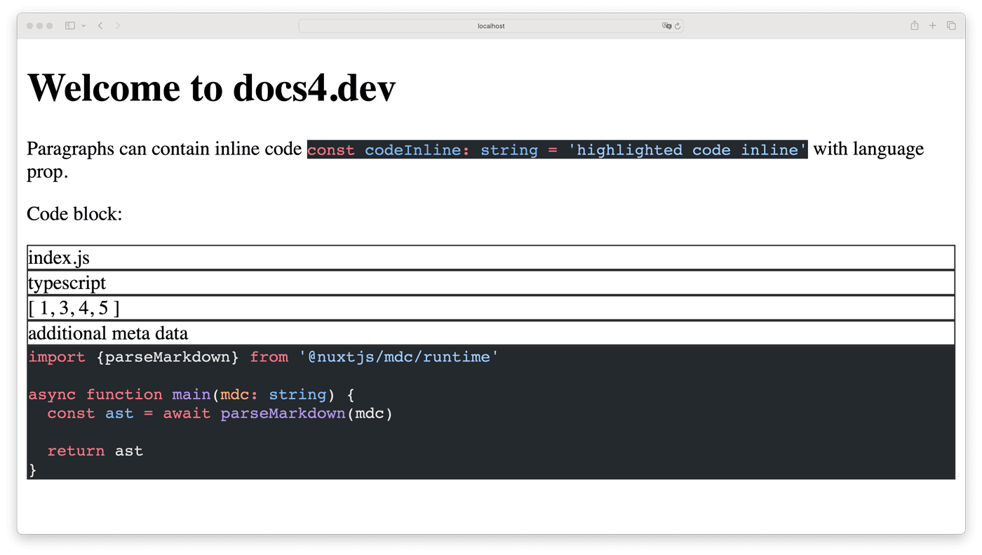
Let's set github-dark as the default theme (theme: github-dark) and enable the background color (wrapperStyle: true). Further, we select only the languages we need (langs: ['ts']):
mdc: {
  highlight: {
    theme: 'github-dark',
    langs: ['ts'],
    wrapperStyle: true
  }
}
The final nuxt.config.ts looks as follows:
export default defineNuxtConfig({
  modules: ['@nuxtjs/mdc'],
  mdc: {
    highlight: {
      theme: 'github-dark',
      langs: ['ts'],
      wrapperStyle: true
    }
  }
})
If you check http://localhost:3000 again you will now notice that both, the code block and the inline code are now highlighted with the TypeScript preset from the github-dark theme.
Summary
Nuxt MDC simplifies the parsing and rendering of Markdown fetched from a CMS or API. It offers numerous features, including code highlighting and an extended syntax (MarkDown Components) allowing the use of Vue components within Markdown. This makes it a compelling alternative to the Nuxt Content module or markdown-it. Additionally, Nuxt MDC provides Prose components as an alternative to regular HTML tags, allowing for the addition of extra features to Markdown content. The Shiki syntax highlighter bundled with the module streamlines code highlighting, requiring minimal configuration to get started.