Easy Bootstrap 5 Integration with Vue 3: Step-by-Step Guide

Introduction
Bootstrap is a popular front-end framework for creating responsive web applications. It offers many ready-to-use components and utility classes, is highly customizable, and can be integrated with frameworks like Vue 3.
Bootstrap provides different sets of styles (CSS and SCSS) and JavaScript plugins. In Vue 3, adding the styles is as easy as including the compiled CSS with a single line of code. Alternatively, the SCSS source files can be added and compiled with a Sass compiler to take advantage of mixins, variables, functions and more. Besides the styles, Bootstrap offers JavaScript plugins with both HTML data and programmatic APIs to easily build and control modals, tooltips, and other components. These plugins are available in a bundled version or individually.
In This Guide
This guide walks you step-by-step through setting up a new Vue 3 project and integrating Bootstrap 5 using the npm package manager. You'll learn how to:
- Initialize a new Vue 3 project
- Add Bootstrap 5 to your project via npm.
- Load the bundled and minified CSS and JavaScript files.
- Utilize Vue's provide() and inject() functions to make Bootstrap's JavaScript plugins available throughout your application.
- Control Bootstrap’s plugins using both data attributes and programmatic APIs.
- Override Bootstrap CSS Variables
Throughout this guide, we'll use the <script setup> syntax and the Composition API.
Setup
- Vue 3.4.29
- Vite 5.3.1
- Bootstrap 5.3.3
- node 20.14.0
- npm 10.7.0
Prerequisites
- Basic understanding of Vue 3
- Basic understanding of Bootstrap 5
- Understanding of the different Bootstrap 5 types (e.g. compiled CSS and JavaScript bundles vs. sources code. Rrefer to the Bootstrap 5 documentation for more information.
- node.js and npm are installed on your machine
Creating a New Vue 3 Project
Start by initiating a new Vue 3 project:
npm create vue@latest
You'll be prompted to choose a project name and further options. In this guide, select JavaScript and skip the remaining options by selecting No.
Switch to the project root directory and install the required modules:
cd <your-project-name>
npm install
Adding Bootstrap 5 to Vue 3 with npm
Next, install Bootstrap via npm (version 5.3.3 is used in this guide):
npm install bootstrap@5.3.3
The various styles and JavaScript files from Bootstrap will now be available under node_modules/bootstrap/.
To utilize all Bootstrap features, we need to make its styles and JavaScript available to Vue 3. For styles can be added by importing the compiled CSS (bootstrap.css), from /bootstrap/dist/css/. Some features require additional JavaScript from Bootstrap, which must be imported as well. The bootstrap.bundle.js file in /bootstrap/dist/js/ contains all JavaScript, including floating-ui (formerly popper.js), in a bundled and minified version.
Importing Bootstrap 5 CSS
To make the Bootstrap styles available, import the compiled CSS at the first line of your CSS entry file, main.css in /src/asset/:
@import 'bootstrap/dist/css/bootstrap.css';
Importing Bootstrap`s CSS at the first line, allows usw to override Bootstrap’s default CSS variables.
Importing Bootstrap 5 JavaScript
Bootstrap's JavaScript plugins can be made available to the application using Vue's provide() and inject() functions. The provide() function allows to make data available at the app level, which can then be injected into components with the inject() function. Adjust the main.js file as follows:
import * as bootstrap from 'bootstrap/dist/js/bootstrap.bundle';
import './assets/main.css';

import { createApp } from 'vue';
import App from './App.vue';

const app = createApp(App);
app.provide('bootstrap', bootstrap);
app.mount('#app');
In line 1, import Bootstrap from the bootstrap.bundle.js file under the bootstrap namespace. The default createApp(App).mount('#app') instantiation and mounting function are split for clarity. In line 8, the Bootstrap 5 JavaScript is provided to the Vue instance. The first argument of provide(), bootstrap, is the injection key under which the provided Bootstrap JavaScript (the second argument) is addressible in descendant components. For more information on provide()/inject() refer to the Vue documentation.
The Bootstrap 5 JavaScript plugins, except tooltips, are now available to your Vue application and can be controlled via HTML data attributes. To control them programmatically, the Bootstrap JavaScript must be made available to the respective component with the inject() function. To make use of tooltips, they must be explicitly enabled vie Bootstrap programmatic API (see the next section).
Verifying Bootstrap is Working Correctly
To verify that Bootstrap works as expected, two components are created. The <BSNavbar> component contains boilerplate code for a navigation bar from the Bootstrap 5 documentation. For demonstration purposes, navbar-expand-lg is removed from the class attribute of the <nav> tag to make the navigation bar expandable on both mobile and desktop. The component is used to demonstrate that Bootstrap’s CSS variables can be overriden and that the programmatic API works, by expanding the navigation bar after the <App> component is mounted.
Create a new file BSNavbar.vue in src/components/with the following content:
<template>
  <nav class="navbar bg-body-tertiary">
    <div class="container-fluid">
      <a class="navbar-brand" href="#">Navbar</a>
      <button class="navbar-toggler" type="button" data-bs-toggle="collapse" data-bs-target="#navbarSupportedContent" aria-controls="navbarSupportedContent" aria-expanded="false" aria-label="Toggle navigation">
        <span class="navbar-toggler-icon"></span>
      </button>
      <div class="collapse navbar-collapse" id="navbarSupportedContent">
        <ul class="navbar-nav me-auto mb-2 mb-lg-0">
          <li class="nav-item">
            <a class="nav-link active" aria-current="page" href="#">Home</a>
          </li>
          <li class="nav-item">
            <a class="nav-link" href="#">Link</a>
          </li>
          <li class="nav-item dropdown">
            <a class="nav-link dropdown-toggle" href="#" role="button" data-bs-toggle="dropdown" aria-expanded="false">
              Dropdown
            </a>
            <ul class="dropdown-menu">
              <li><a class="dropdown-item" href="#">Action</a></li>
              <li><a class="dropdown-item" href="#">Another action</a></li>
              <li><hr class="dropdown-divider"></li>
              <li><a class="dropdown-item" href="#">Something else here</a></li>
            </ul>
          </li>
          <li class="nav-item">
            <a class="nav-link disabled" aria-disabled="true">Disabled</a>
          </li>
        </ul>
        <form class="d-flex" role="search">
          <input class="form-control me-2" type="search" placeholder="Search" aria-label="Search">
          <button class="btn btn-outline-success" type="submit">Search</button>
        </form>
      </div>
    </div>
  </nav>
</template>
The second component, <BSTooltip>, contains boilerplate code from Bootstrap’s tooltips documentation to demonstrate how to enable tooltips programmatically. Create BSTooltip.vue under src/components/ with the following content:
<template>
  <p class="muted">Placeholder text to demonstrate some <a href="#" data-bs-toggle="tooltip" data-bs-title="Default tooltip">inline links</a> with tooltips. This is now just filler, no killer. Content placed here just to mimic the presence of <a href="#" data-bs-toggle="tooltip" data-bs-title="Another tooltip">real text</a>. And all that just to give you an idea of how tooltips would look when used in real-world situations. So hopefully you've now seen how <a href="#" data-bs-toggle="tooltip" data-bs-title="Another one here too">these tooltips on links</a> can work in practice, once you use them on <a href="#" data-bs-toggle="tooltip" data-bs-title="The last tip!">your own</a> site or project.</p>
</template>
Next, remove the contents from the <App> component and add the <BSNavbar> and <BSTooltip> component as follows:
<script setup>
import BSTooltip from '@/components/BSTooltip.vue';
import BSNavbar from '@/components/BSNavbar.vue';
</script>

<template>
  <div id="wrapper">
    <BSNavbar />
    <BSTooltip />
  </div>
</template>

<style scoped>
#wrapper {
  max-width: 600px;
  margin: 0 auto;
}
</style>
Overriding CSS Variables
To verify Bootstrap 5 CSS variables are available and can be overridden, the default background color of the Bootstrap navigation bar is changed. Its color is defined in the --bs-tertiary-bg-rgb CSS variable, which is assigned the RGB values separated by a comma. To override it, add the following CSS after the Bootstrap CSS import in main.css:
@import 'bootstrap/dist/css/bootstrap.css';

:root {
    --bs-tertiary-bg-rgb: 101, 127, 220;
}
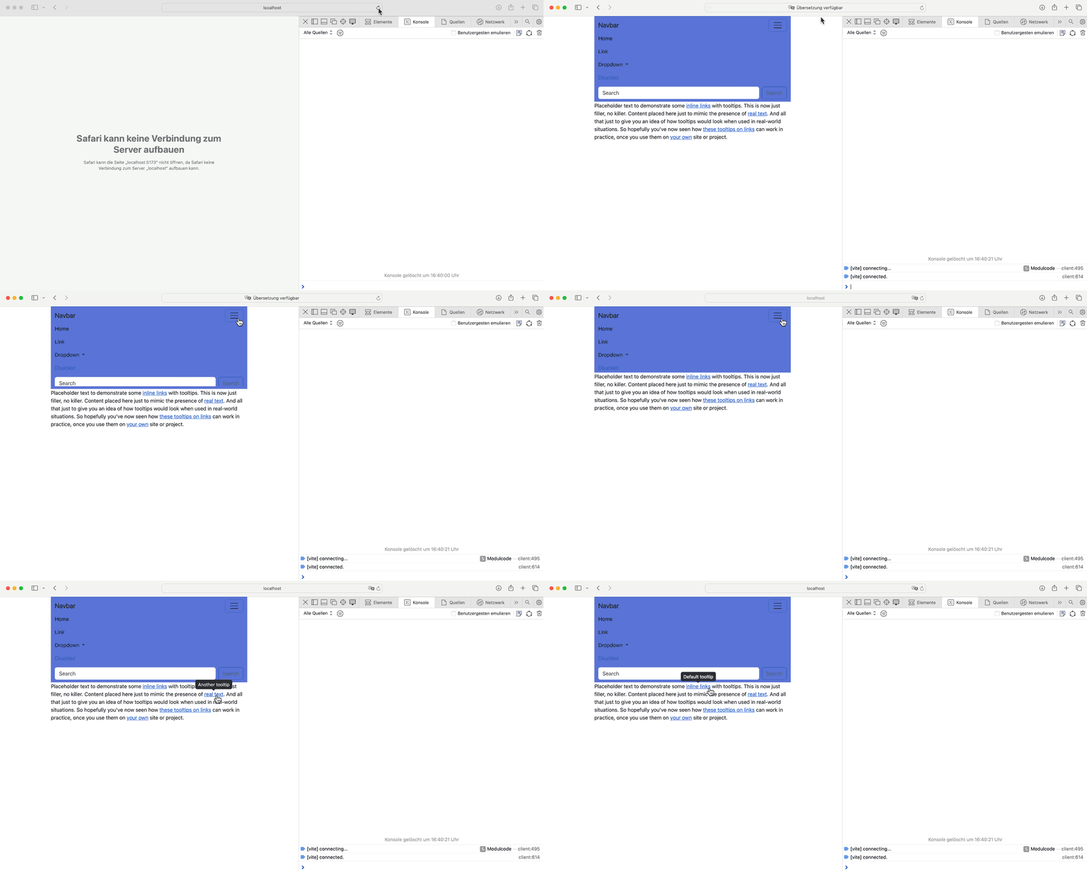
The remaining CSS from Vue in main.css and App.vue is removed for simplicity. After starting the development server with npm run dev and browsing http://localhost:5173/, you will see the now color being applied, as shown in the picture below.
Controlling the JavaScript Plugins With the Data and the Programmatic API
To verify the programmatic API is working correctly, expand the navbar programmatically after the component is mounted. For simplicity, this is done in the <App> component but can also be done in the <BSNavbar> component. Add the following highlighted lines to the <script setup> code of the <App> component:
<script setup>
import  { onMounted, inject } from 'vue';
import BSTooltip from '@/components/BSTooltip.vue';
import BSNavbar from '@/components/BSNavbar.vue';

// Inject Bootstrap with the same key as defined in main.js
const bootstrap = inject('bootstrap');

onMounted(() => {
  try {
    // Expanding the navbar.
    const collapse = new bootstrap.Collapse('#navbarSupportedContent');
    collapse.show();
  } catch (e) {
    console.log('Bootstrap error: ', e);
  }
});
</script>

…
In line 7, the Bootstrap 5 JavaScript is injected into the component with the same injection key as defined in the provide() function in main.js file. To expand the navbar after the component has been mounted, a new Collapse instance is created in line 12. The instance is then used to expand the navbar by invoking the show() function in line 13. Since the Bootstrap plugin manipulates the DOM, the onMounted() lifecycle hook is used to ensure the DOM tree of the component is already created and inserted. Running the development server will show the navbar is expanding automatically, verifying that the programmatic API works. Clicking the hamburger icon makes the navbar collapse, verifying that the data API is working as well (see the image below).
Controlling the Tooltips
Tooltips must be initialized manually. If tooltips are used in multiple components, this can be done once in the <App> component or in a separate Vue plugin using Bootstrap’s programmatic API. The Bootstrap documentation provides an example on how to enable all of the tooltips. Add the following highlighted lines (16 and 17) to the <App> component:
<script setup>
import  { onMounted, inject } from "vue";
import BSTooltip from "@/components/BSTooltip.vue";
import BSNavbar from "@/components/BSNavbar.vue";

// Inject Bootstrap with the same key as defined in main.js
const bootstrap = inject("bootstrap");

onMounted(() => {
  try {
    // Expanding the navbar.
    const collapse = new bootstrap.Collapse('#navbarSupportedContent');
    collapse.show();

    // Tooltips are opt-in and must be initialized manually!
    const tooltipTriggerList = document.querySelectorAll('[data-bs-toggle="tooltip"]')
    const tooltipList = [...tooltipTriggerList].map(tooltipTriggerEl => new bootstrap.Tooltip(tooltipTriggerEl))
  } catch (e) {
    console.log('Bootstrap error: ', e);
  }
});
</script>
Since this process requires the DOM tree of the component to be created and inserted in the DOM, the initialization must be done in the onMounted() lifecycle hook. Running the development server and hovering over the links in the text will show the tooltips appearing.
The following image demonstrates the overall result.

A Word on Compatibility and Alternatives
Instead of integrating the bundled and compiled CSS, you can integrate the source SCSS files. This requires an additional Sass compiler and auto-prefixer but allows you to use mixins, functions, and more that comes with Bootstrap 5.
While you can use all of Bootstrap's CSS classes, the JavaScript is not fully compatible with Vue and similar frameworks, which assume full knowledge of the DOM (refer to the Bootstrap documentation). To avoid compatibility issues, one could integrate, BootstrapVueNext instead, a Vue 3 specifc module implementing Bootstrap 5 components. However, at the time of writing this guide, BootstrapVueNext is still in alpha version.
Summary
Bootstrap 5 can be integrated into a Vue 3 application in various ways, such as loading the bundled and compiled CSS and JavaScript or integrating the source SCSS files and JavaScript plugins individually. This guide demonstrates the Integration of the bundled Bootstrap 5 version in a way that allows you to override the CSS variables and control the JavaScript plugins using both Bootstrap’s data and programmatic APIs. However, it is important to note that the JavaScript plugins are not fully compatible with frameworks like Vue 3.